


management.me1marketing@gmail.com
August 22, 2025
Let’s face it: everyone’s glued to their phone. Your customers. Your prospects. Even your mom. Content that doesn’t work on mobile? It’s invisible.
If your posts, blog, or ads aren’t mobile-first… you’re not just lagging. You’re losing.
That’s the real truth. And here’s why mobile-first content is urgent, powerful, and impossible to ignore in 2025.
Remember when desktop ruled? You’d craft content, then worry about how it looks on mobile later.
That era is gone.
Mobile-first means thinking mobile before anything else. Shorter headlines. Vertical visuals. Fast loading. Touch-friendly layouts. Every word. Every image. Every click is designed for the little screen.
People swipe before thinking. Research shows 57% of users won’t recommend a business with a poorly designed mobile site. Yes, that’s real data.
And get this, most mobile users leave a page within 3 seconds if it flops.
That’s the harsh reality.
Unless your content plays well on mobile, it’s a silent turn-off. Not just frustration. Lost opportunities.

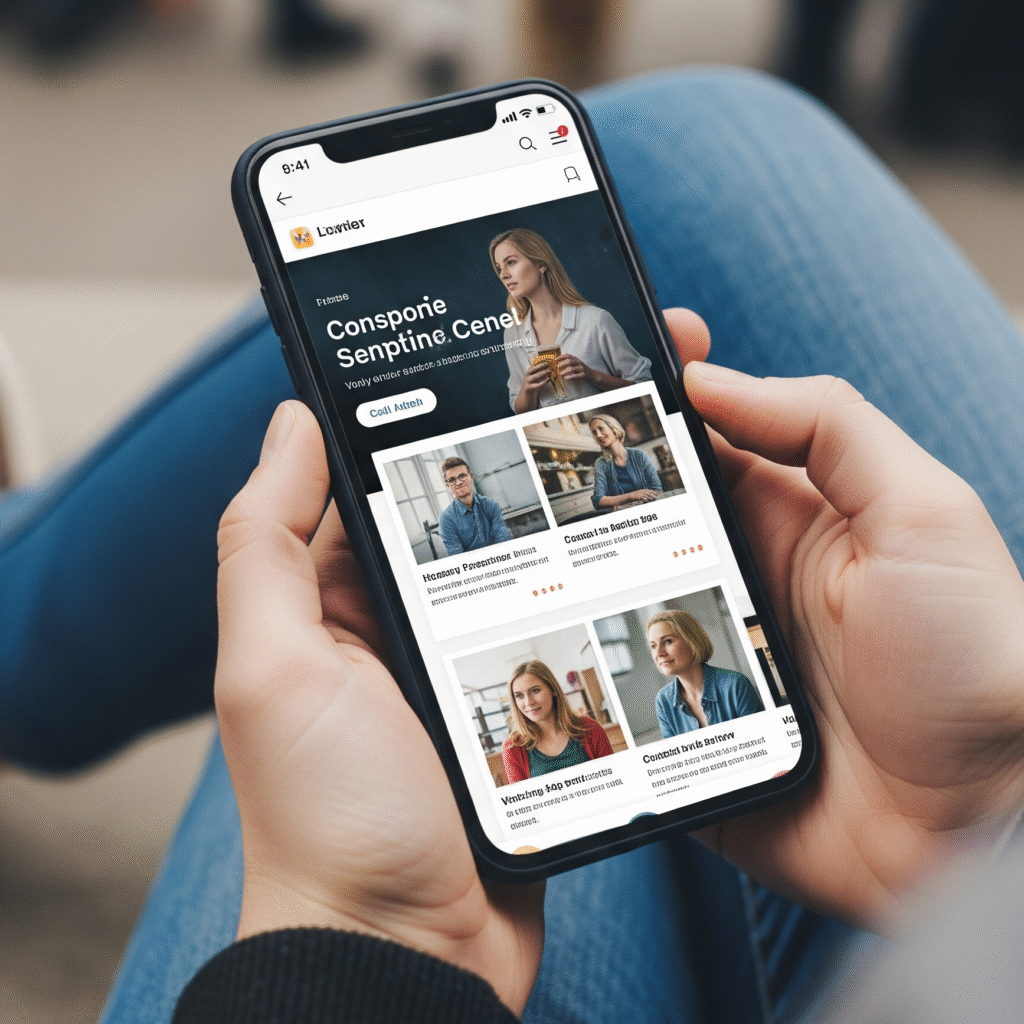
We know phones. We live with them. And we build content that works there from the very first draft to the final click.
At Me1 Marketing, we craft mobile-first campaigns that:
We don’t just adapt content. We build it for mobile first. Always.
Let me tell you about a cafe client we helped.
Their desktop website looked okay. But on mobile it was slow. The menu popped off-screen. The “Order Now” button was tiny. And visitors were bouncing fast.
We rebuilt it: vertical layout, fast images, clear buttons, touch-friendly design, mobile-first menu. Few weeks later? Mobile traffic stayed. Orders via mobile jumped by 60%. Bounce rate dropped 35%.
That’s mobile-first in action not theory.
Even if you’re a solo person, a micro brand, or a local shop mobile-first matters. You don’t need big budgets. But you do need clarity.
Put the user first. And in 2025, the user is almost always on mobile.
Short videos or animations (micro-engagements work best)
Your website isn’t a billboard anymore. It’s a phone. A tiny window.
Make sure it works. Well. Everywhere.
At Me1 Marketing, mobile-first isn’t just best practice it’s our starting point. Ready to make your brand mobile-first? Let’s make every scroll count.


Websites and Marketing to Reputation Repair. Trusted by Businesses Worldwide to create Visibility, Credibility, and Lasting impact.
Claim your free consultation now. Get expert advice no cost, no obligation.
Copyright by Me1 Marketing. All rights reserved.